Using ggiraph for interactive plots in R Markdown
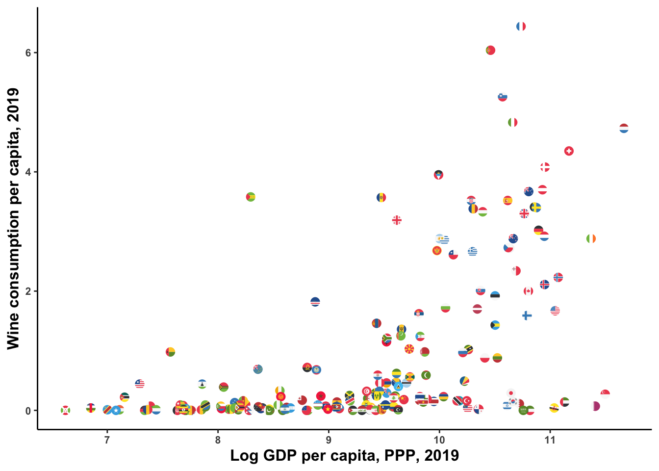
For those looking for an alternative to plotly to create vectorized/interactive graphics keeping ggplot syntax: ggiraph seems to be a great option. Brief example below. I downloaded some data on wine consumption per capita and joined it to data on GDP per capita, using the great WDI package to interact with the World Bank API (inspired by a tweet by Andres Lopez). I use the awesome ggflags package to plot each country with its flag instead of a point.
gdppc <- WDI::WDI(indicator = "NY.GDP.PCAP.PP.KD", start = 2019, end = 2019) %>%
  setNames(c("code", "country", "gdppc", "year")) %>%
  select(-year) %>%
  mutate(code = tolower(code))

vino <- read_csv("wine-consumption-per-person.csv") %>%
  setNames(c("country", "code", "year", "wine")) %>%
  filter(year==2019) %>%
  mutate(code = tolower(countrycode(tolower(code), origin="iso3c", destination = "iso2c"))) %>%
  left_join(gdppc, by="code")

vino %>%
  mutate(log_gdp = log(gdppc),
         log_wine = log(wine)) %>%
  ggplot(aes(x=log_gdp, y=wine)) +
 theme_classic() +
  geom_flag(aes(country=code), size=3) +
  labs(x="Log GDP per capita, PPP, 2019", y="Wine consumption per capita, 2019") +
  theme(axis.text = element_text(face="bold", size=8),
        axis.title = element_text(face= "bold", size=12),
        plot.caption = element_text(size=6),
        plot.title = element_text(size=18, face="bold"))
ggiraph plots build on ggplot syntax. The geometry geom_point_interactive is an extended version of geom_point with additional interactive aesthetics, like tooltip and data_id, which are quite straightforward to apply.
giraffe_points <- vino %>%
  mutate(country.x = str_replace_all(country.x, "'", ""),
    log_gdp = log(gdppc),
         log_wine = log(wine)) %>%
  ggplot(aes(x=log_gdp, y=wine)) +
 theme_classic() +
  geom_point_interactive(aes(tooltip = country.x, data_id = country.x)) +
  labs(x="Log GDP per capita, PPP, 2019", y="Wine consumption per capita, 2019") +
  theme(axis.text = element_text(face="bold", size=8),
        axis.title = element_text(face= "bold", size=12),
        plot.caption = element_text(size=6),
        plot.title = element_text(size=18, face="bold"))

girafe(ggobj = giraffe_points)
Using flags and points:
giraffe_points <- vino %>%
  mutate(country.x = str_replace_all(country.x, "'", ""),
    log_gdp = log(gdppc),
         log_wine = log(wine)) %>%
  ggplot(aes(x=log_gdp, y=wine)) +
 theme_classic() +
  geom_flag(aes(country=code), size=3) +
  geom_point_interactive(aes(tooltip = country.x, data_id = country.x), alpha=0.01) +
  labs(x="Log GDP per capita, PPP, 2019", y="Wine consumption per capita, 2019") +
  theme(axis.text = element_text(face="bold", size=8),
        axis.title = element_text(face= "bold", size=12),
        plot.caption = element_text(size=6),
        plot.title = element_text(size=18, face="bold"))

girafe(ggobj = giraffe_points)
Federico Tiberti
Data Scientist
My interests include comparative political economy, development, statistical methods and data science.